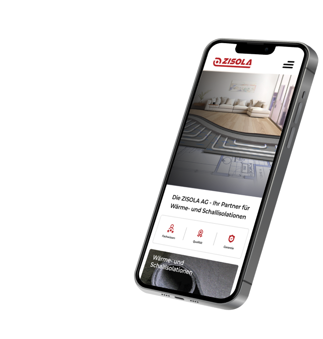
ZISOLA AG needed to reposition its brand in order to reach new target groups and strengthen its market presence. Our team developed a comprehensive branding strategy that included a new, appealing logo, a clear and consistent brand message, and a well-thought-out visual concept. In addition, we created a modern, user-friendly website that not only reflects the company's image but also effectively supports lead generation. These measures enabled ZISOLA AG to expand its reach to architects and end consumers and build a strong network.
 Work scope
To support ZISOLA AG in its repositioning, we implemented various key measures.
From strategy to concrete results

Logo-Redesign
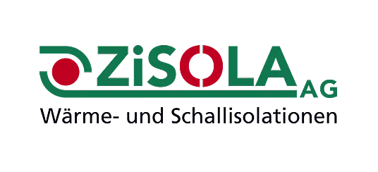
The original ZISOLA logo was outdated and unappealing. The two-colour design distracted from the essentials, while the green, which was intended to symbolise sustainability, led to visual overload in the context of the logo.
Our solution for modernising the ZISOLA logo was to introduce more dynamic and powerful typography. The single colour and modern style lend the logo strength and dynamism, while the iconic roll unfurling beneath the company name has been discreetly retained.

Visual brand identity for ZISOLA products
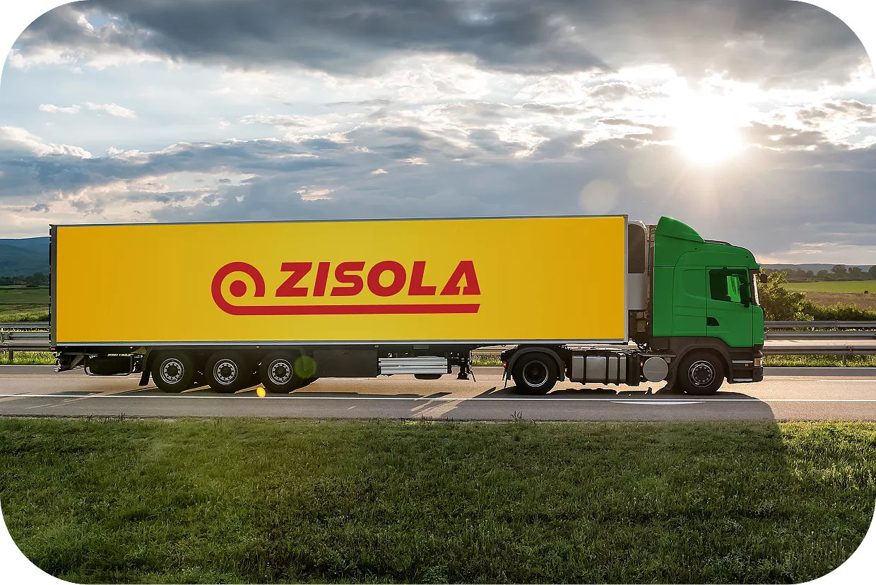
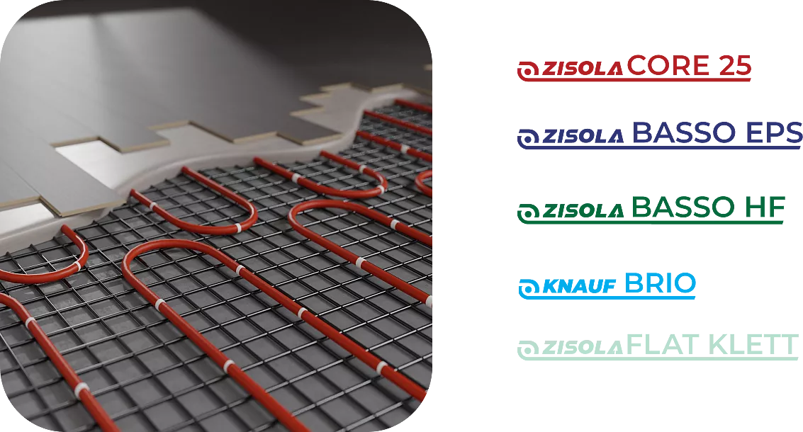
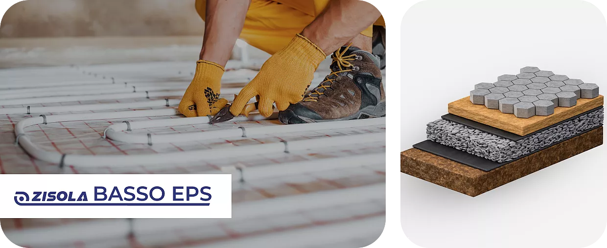
ZISOLA is launching its products on the market for the first time, and we are supporting them with their branding. Our task was to design logos that combine the company logo with the product names in order to make both the company brand and the product brands recognisable. Depending on the product type, the logos vary in colour to visually highlight the individual product categories.
Visual identity and messages
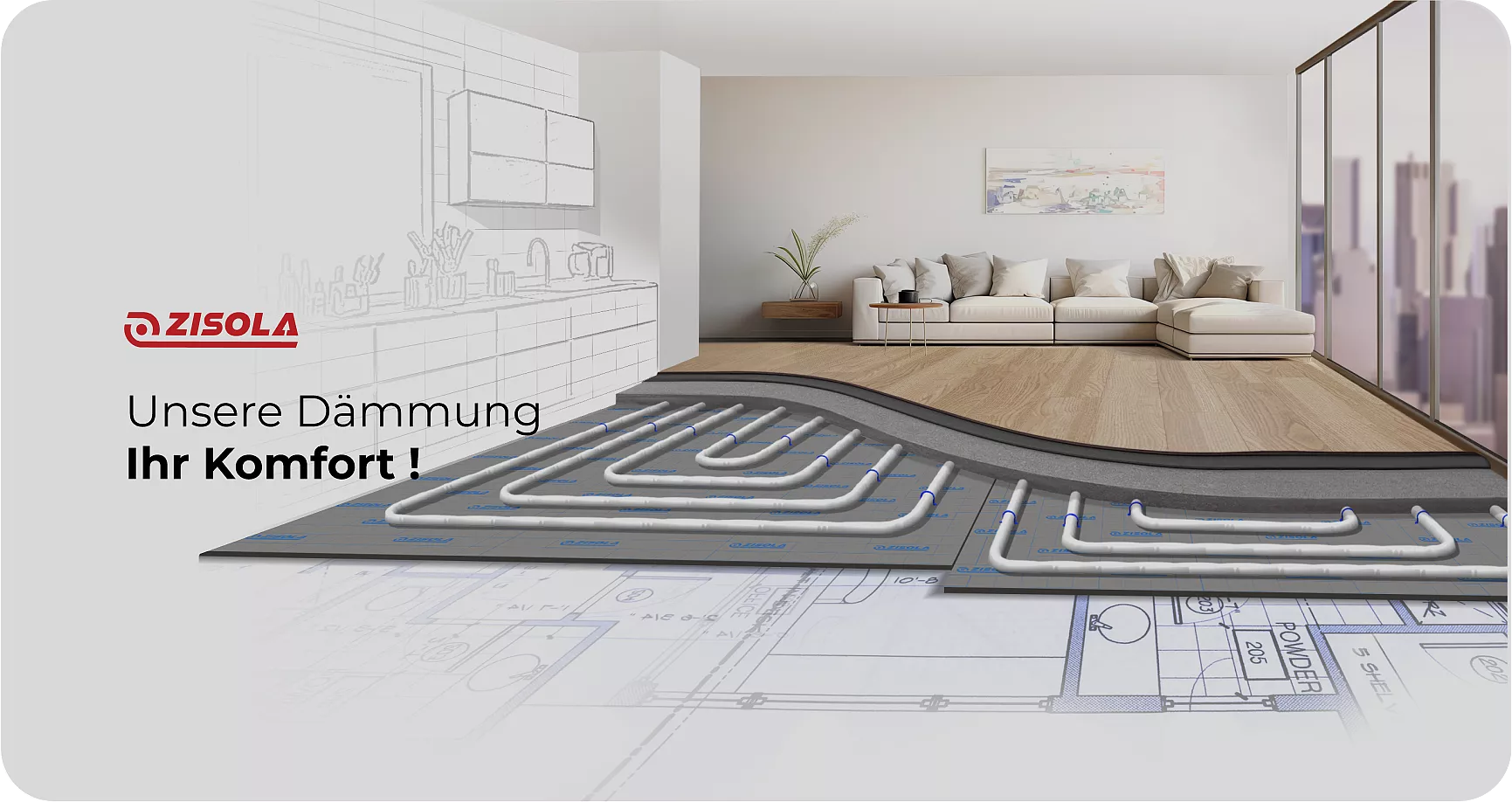
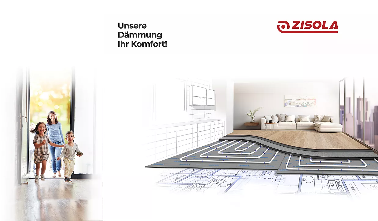
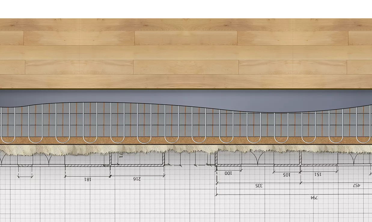
As part of our project, we developed key visuals and accompanying messages that support and reinforce ZISOLA's new market presence. These visual elements and texts were carefully designed to clearly communicate the brand's identity and values and to effectively address the target groups.
Web platform
User Journey: From the homepage to a qualified lead
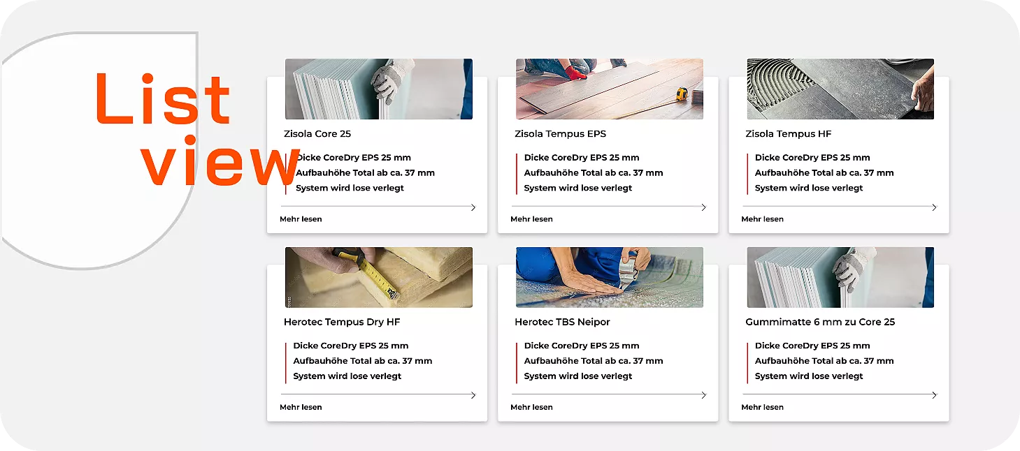
Together with ZISOLA, we have developed a new user journey that aims to build a network and generate new leads by specifically targeting new audiences. Visitors are directed to the areas relevant to them right from the start page. A clear list and detailed product views allow users to obtain all the necessary information, view application experiences and download white papers, technical data sheets and other information required for installation.
Product configurator
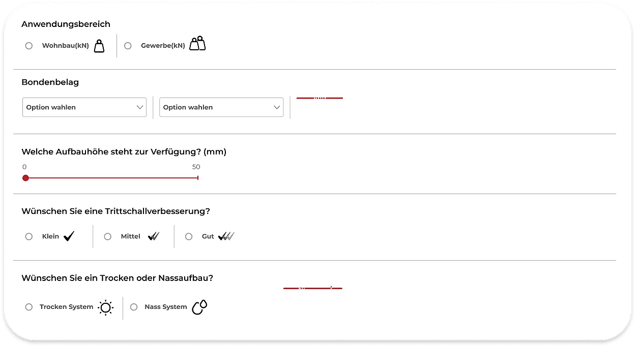
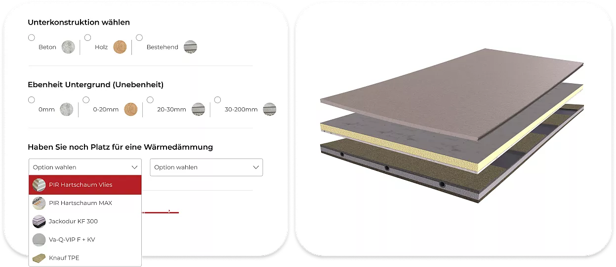
To simplify the decision-making process for our customers, we have developed a user-friendly product configurator for ZISOLA. This allows users to select customised solutions that are tailored precisely to their specific requirements. By taking various parameters into account, they can quickly and efficiently find the right products for their projects.
Brand presence at the exhibition stand
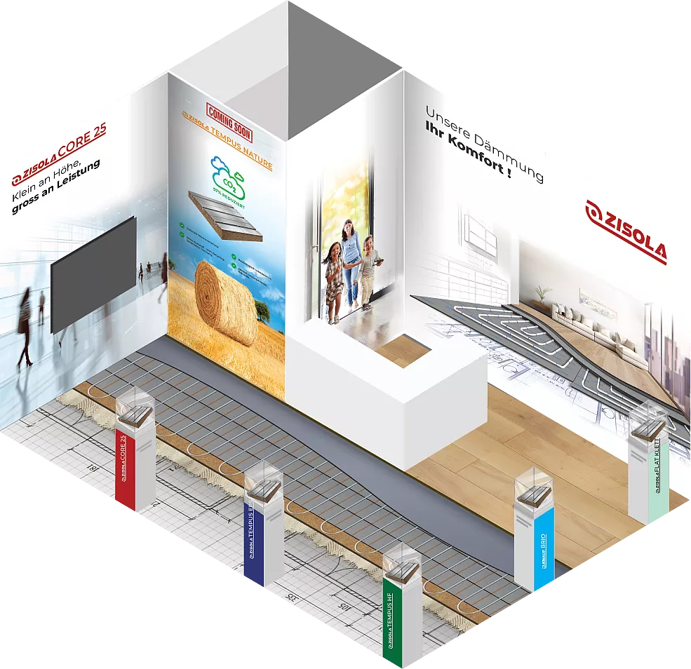
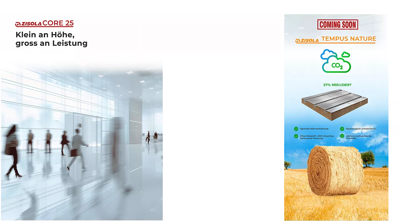
As part of our project for ZISOLA, we also took on the branding of their exhibition stand to ensure an impressive and consistent brand presence at trade fairs. Our approach included the design of visual elements that would both highlight the brand and attract the attention of visitors. Through targeted design elements and a consistent brand message, we created an appealing stand that effectively presents the ZISOLA brand and clearly communicates its core messages.
Product brochure
Fresh off the press: product range in pocket format
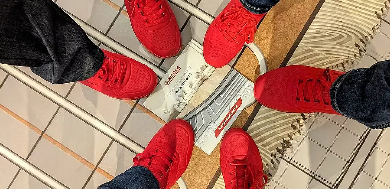
ZISOLA required a handy and informative material that would reach directly into the hands of interested parties. We developed a compact brochure that presents the new product range in a concise manner. The format is perfect for use at trade fairs to give potential customers a clear and direct overview.
Inspired by what you’ve seen? Let’s start shaping your own success story — together.
Thank you for seeing our work!


